# matplotlib and pandas come with most Python installations
import matplotlib.pyplot as plt
import pandas as pd

# Install seaborn if needed
# uv pip install seaborn
import seaborn as sns

# Install plotly if needed
# uv pip install plotly
import plotly.express as px2.3. Data Visualisation
Introduction
Effective data visualisation is fundamental to understanding patterns, communicating findings, and making data-driven decisions. This section covers essential visualisation techniques for tabular and spatial data using Python’s powerful plotting libraries.
Before we dive into geospatial visualisation, you need to master the core plotting tools that underpin all visual analysis in Python.
Why Visualisation Matters
Visualisation is not merely an aesthetic exercise; it is an analytical tool that reveals patterns invisible in summary statistics alone. A well-constructed plot helps you explore data patterns and relationships, identify outliers and anomalies that might indicate data quality issues or genuinely unusual phenomena, communicate findings to audiences with varying levels of technical expertise, validate the results of your analytical operations, and guide the direction of further investigation.
In pedestrian mobility research, visualisation is particularly powerful because human movement patterns are inherently spatial and temporal, and a single time-series plot of pedestrian counts can reveal commuting peaks, lunchtime surges, and weekend patterns that no summary statistic could convey.
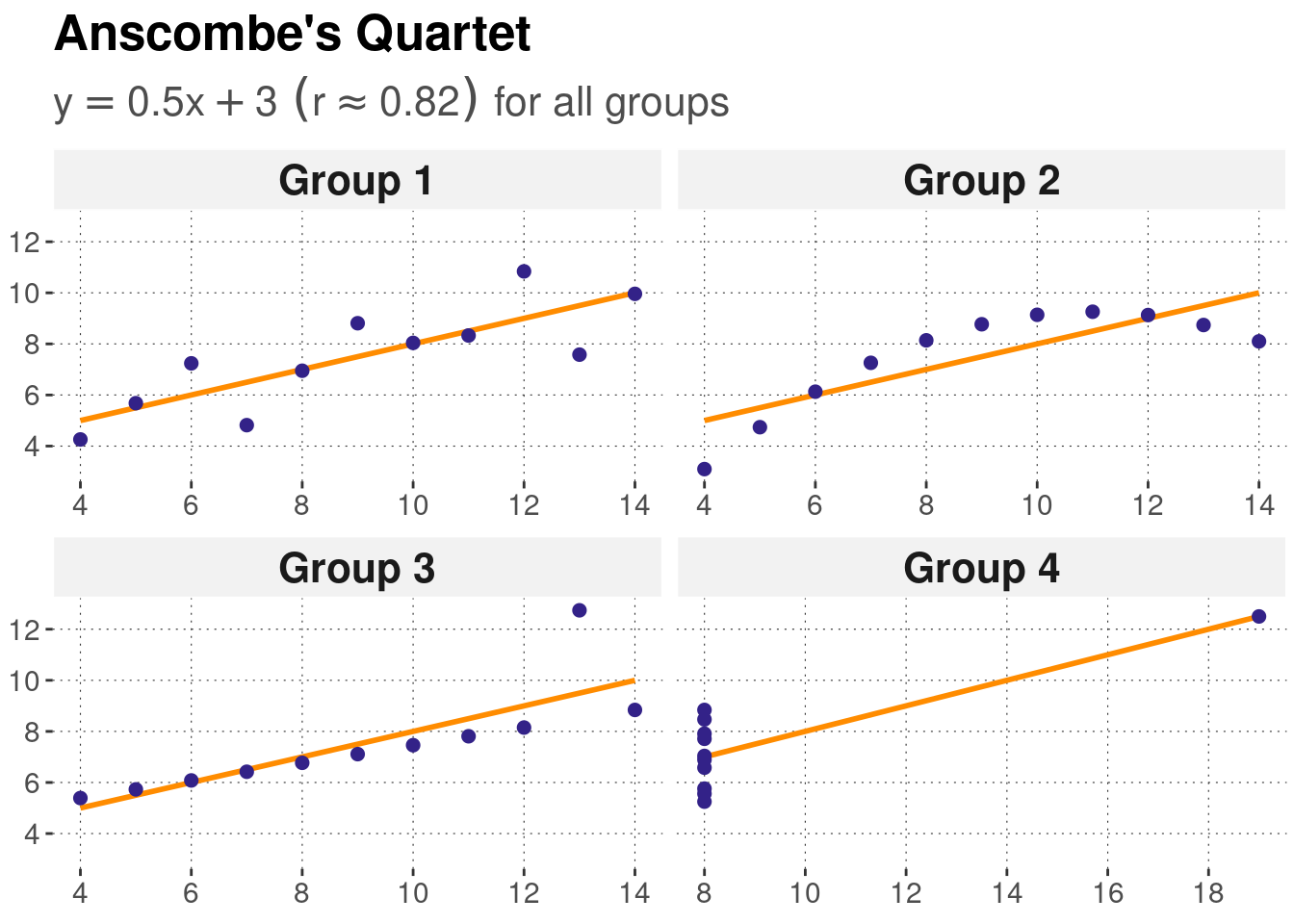
Anscombe’s Quartet
Four datasets with identical summary statistics but completely different patterns. Only visible through visualisation. This classic example demonstrates why we must always plot our data!
Python Visualisation Libraries
The Ecosystem
Python has a rich ecosystem of visualisation libraries, and understanding how they relate to each other helps you choose the right tool for each task.
matplotlib is the foundation of Python plotting. It gives you low-level control over every element of a figure, from tick mark placement to colour gradients. This verbosity makes it powerful but sometimes tedious for quick exploration. Nearly all other Python plotting libraries are built on top of matplotlib, so understanding its architecture pays dividends across the ecosystem.
pandas plotting provides built-in plotting methods directly on DataFrames and Series. It is the fastest route from data to plot, ideal for rapid exploration during analysis. Because it uses matplotlib behind the scenes, you can always drop down to matplotlib’s API when you need more customisation.
seaborn offers a high-level interface to matplotlib specifically designed for statistical graphics. Its default styles are polished and publication-ready, and it includes built-in functions for regression lines, distribution fits, and categorical comparisons. For exploratory data analysis, seaborn is often the most efficient choice.
plotly produces web-based interactive graphics with hover information, zooming, and panning. It excels in dashboard contexts and can export standalone HTML files, making it well-suited for sharing results with collaborators who may not have Python installed.
Which library should I use?
The choice depends on your immediate goal. For quick exploration during an analysis session, pandas plotting is the fastest path.
For statistical analysis where you want to see distributions, regression fits, or categorical comparisons, seaborn provides the richest set of built-in tools.
When you need precise control over every element for publication-quality figures, matplotlib’s object-oriented interface gives you that power.
For interactive dashboards that stakeholders or collaborators can explore in their browser, plotly is the best option. For GIS and spatial data visualisation, Section 2.4 introduces specialised tools built on these foundations.
Installation
Understanding Matplotlib Architecture
Before creating plots, it’s crucial to understand how matplotlib is structured. This knowledge will make customisation much easier.
The Three-Layer Architecture
Matplotlib has three main layers:
- Backend layer: Handles the actual drawing to screen or file
- Artist layer: All objects you see on the plot (lines, text, axes)
- Scripting layer (
pyplot): Convenient interface for common tasks
Most of the time, you’ll work with the scripting layer, but understanding the artist layer helps with customisation.
Anatomy of a Plot
Every matplotlib plot has a hierarchical structure:
Figure (the entire window/page)
└── Axes (the plotting area - can have multiple)
    ├── Axis (x-axis, y-axis)
    ├── Title
    ├── Labels
    ├── Legend
    ├── Grid
    └── Plot elements (lines, points, etc.)
Key concepts:
- Figure: The entire canvas - the window or page
- Axes: A single plot area (confusingly named - not the same as axis!)
- Axis: The actual x and y axes with ticks and labels
- Artists: Everything you see (lines, text, patches, etc.)
Common Confusion: Axes vs Axis
- Axes (plural): A complete plot area with its own coordinate system
- Axis (singular): The x or y axis line with ticks and labels
In matplotlib, ax typically refers to an Axes object, not an axis line!
Two Ways to Create Plots
There are two main approaches to creating matplotlib plots:
1. pyplot interface (implicit)
import matplotlib.pyplot as plt

plt.plot([1, 2, 3], [1, 4, 9])
plt.xlabel('X axis')
plt.ylabel('Y axis')
plt.title('My Plot')
plt.show()
2. Object-oriented interface (explicit) - RECOMMENDED
import matplotlib.pyplot as plt

fig, ax = plt.subplots()  # Create figure and axes explicitly
ax.plot([1, 2, 3], [1, 4, 9])
ax.set_xlabel('X axis')
ax.set_ylabel('Y axis')
ax.set_title('My Plot')
plt.show()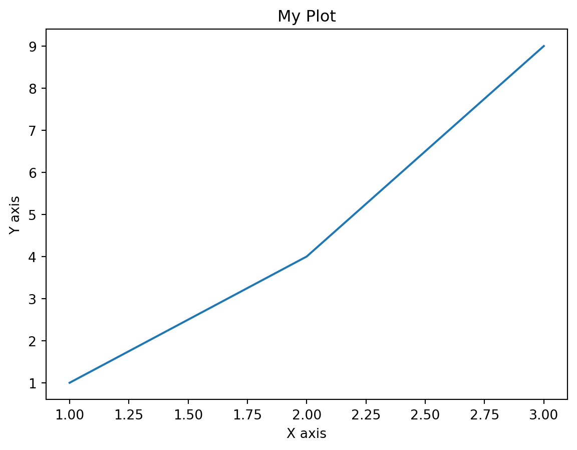
Use the Object-Oriented Interface
While the pyplot interface is more concise, the object-oriented approach is more explicit and gives you better control, especially when creating multiple subplots. It’s the recommended approach for all but the simplest plots.
Your First Plot: Step by Step
Let’s create a simple plot step by step, understanding each component:
import matplotlib.pyplot as plt
import numpy as np

# Step 1: Prepare your data
x = np.linspace(0, 10, 100)  # 100 points from 0 to 10
y = np.sin(x)

# Step 2: Create figure and axes
fig, ax = plt.subplots(figsize=(10, 6))  # Width=10, Height=6 inches

# Step 3: Plot the data
ax.plot(x, y)

# Step 4: Customise the plot
ax.set_xlabel('X values', fontsize=12)
ax.set_ylabel('Y values', fontsize=12)
ax.set_title('Sine Wave', fontsize=14, fontweight='bold')
ax.grid(True, alpha=0.3)  # Add semi-transparent grid

# Step 5: Display or save
plt.tight_layout()  # Adjust spacing
plt.show()
Breaking it down:
- Data preparation: We create x values and calculate y = sin(x)
- Figure creation:
plt.subplots()returns both a Figure and an Axes - Plotting:
ax.plot()draws the line - Customisation: Set labels, title, and grid
- Display:
plt.show()renders the plot
Basic Plot Types
Let’s explore the fundamental plot types you’ll use most often.
Line Plots
Line plots show trends and continuous data, perfect for time series.
import matplotlib.pyplot as plt
import numpy as np
import pandas as pd

# Example 1: Simple line plot
fig, ax = plt.subplots(figsize=(10, 6))

x = np.linspace(0, 10, 100)
y = np.sin(x)

ax.plot(x, y, linewidth=2, color='steelblue')
ax.set_xlabel('X axis')
ax.set_ylabel('Y axis')
ax.set_title('Simple Line Plot')
ax.grid(True, alpha=0.3)

plt.tight_layout()
plt.show()

# Example 2: Time series with dates
dates = pd.date_range('2024-01-01', periods=100)
values = np.cumsum(np.random.randn(100))  # Random walk

fig, ax = plt.subplots(figsize=(12, 6))
ax.plot(dates, values, linewidth=2, color='darkgreen')
ax.set_xlabel('Date')
ax.set_ylabel('Value')
ax.set_title('Time Series Example')
ax.grid(True, alpha=0.3)

# Rotate x-axis labels for better readability
plt.xticks(rotation=45)
plt.tight_layout()
plt.show()
Common line styles:
ax.plot(x, y, linestyle='-')   # Solid line (default)
ax.plot(x, y, linestyle='--')  # Dashed line
ax.plot(x, y, linestyle=':')   # Dotted line
ax.plot(x, y, linestyle='-.')  # Dash-dot line

# Shorthand notation
ax.plot(x, y, 'b-')   # Blue solid line
ax.plot(x, y, 'r--')  # Red dashed line
ax.plot(x, y, 'g:')   # Green dotted line
Line Styles for Accessibility
When creating plots with multiple lines, use different line styles (solid, dashed, dotted) in addition to colours. This makes your plots readable in grayscale and accessible to colour-blind readers.
Scatter Plots
Scatter plots show relationships between two continuous variables.
fig, ax = plt.subplots(figsize=(10, 6))

# Generate sample data
np.random.seed(42)
x = np.random.randn(100)
y = 2 * x + np.random.randn(100) * 0.5  # y = 2x + noise

# Create scatter plot
ax.scatter(x, y, alpha=0.6, s=50, color='steelblue', edgecolors='black', linewidth=0.5)

ax.set_xlabel('X variable')
ax.set_ylabel('Y variable')
ax.set_title('Scatter Plot Example')
ax.grid(True, alpha=0.3)

plt.tight_layout()
plt.show()
Scatter plot parameters: - alpha: Transparency (0=invisible, 1=opaque) - s: Size of markers - c: Colour (can be array for colour-coding) - marker: Shape (‘o’, ‘s’, ‘^’, ‘v’, ’*’, etc.) - edgecolors: Colour of marker edges - linewidth: Width of marker edges
Bar Charts
Bar charts compare categories or show discrete data.
categories = ['Category A', 'Category B', 'Category C', 'Category D', 'Category E']
values = [23, 45, 56, 78, 32]

fig, ax = plt.subplots(figsize=(10, 6))

# Vertical bar chart
bars = ax.bar(categories, values, color='steelblue', alpha=0.7, edgecolor='black')

# Customise individual bars
bars[2].set_color('coral')  # Highlight third bar

ax.set_xlabel('Category')
ax.set_ylabel('Value')
ax.set_title('Bar Chart Example')
ax.grid(axis='y', alpha=0.3)  # Only horizontal grid lines

plt.tight_layout()
plt.show()

# Horizontal bar chart
fig, ax = plt.subplots(figsize=(10, 6))
ax.barh(categories, values, color='steelblue', alpha=0.7)
ax.set_xlabel('Value')
ax.set_ylabel('Category')
ax.set_title('Horizontal Bar Chart')
ax.grid(axis='x', alpha=0.3)
plt.tight_layout()
plt.show()
Histograms
Histograms show the distribution of a single variable.
# Generate sample data
np.random.seed(42)
data = np.random.randn(1000)  # 1000 random numbers from normal distribution

fig, ax = plt.subplots(figsize=(10, 6))

# Create histogram
n, bins, patches = ax.hist(data, bins=30, edgecolor='black', alpha=0.7, color='steelblue')

ax.set_xlabel('Value')
ax.set_ylabel('Frequency')
ax.set_title('Histogram Example')
ax.grid(axis='y', alpha=0.3)

# Add a line for the mean
mean_value = data.mean()
ax.axvline(mean_value, color='red', linestyle='--', linewidth=2, label=f'Mean = {mean_value:.2f}')
ax.legend()

plt.tight_layout()
plt.show()
Choosing the number of bins: - Too few bins: Lose detail - Too many bins: See noise, not pattern - Rule of thumb: bins = int(np.sqrt(len(data))) - Or use automatic methods: bins='auto', bins='fd', bins='sturges'
Working with Pandas Data
Pandas DataFrames have built-in plotting methods that make visualisation convenient for data exploration.
Basic Pandas Plotting
import pandas as pd
import numpy as np

# Create sample weather data
np.random.seed(42)
dates = pd.date_range('2024-01-01', periods=365)
df = pd.DataFrame({
    'date': dates,
    'temperature': 15 + 10 * np.sin(2 * np.pi * dates.dayofyear / 365) + np.random.randn(365) * 2,
    'rainfall': np.abs(np.random.randn(365) * 10),
    'humidity': 60 + 20 * np.sin(2 * np.pi * dates.dayofyear / 365) + np.random.randn(365) * 5
})

# Plot directly from DataFrame
df.plot(x='date', y='temperature', figsize=(12, 6), title='Temperature Over Year')
plt.ylabel('Temperature (°C)')
plt.show()

# Plot multiple columns
df.set_index('date')[['temperature', 'humidity']].plot(
    figsize=(12, 6),
    title='Temperature and Humidity',
    ylabel='Values',
    alpha=0.7
)
plt.legend(loc='upper right')
plt.show()

# Different plot types
fig, axes = plt.subplots(2, 2, figsize=(14, 10))

# Line plot
df.plot(x='date', y='temperature', ax=axes[0, 0], title='Line Plot')

# Bar plot
df.head(30).plot(x='date', y='rainfall', kind='bar', ax=axes[0, 1], title='Bar Plot')

# Histogram
df['temperature'].plot(kind='hist', bins=30, ax=axes[1, 0], title='Histogram', edgecolor='black')

# Box plot
df[['temperature', 'humidity']].plot(kind='box', ax=axes[1, 1], title='Box Plot')

plt.tight_layout()
plt.show()
Understanding Plot Types
When to use each plot type:
| Plot Type | Use Case | Example |
|---|---|---|
| Line | Trends over time | Temperature over year |
| Scatter | Relationship between variables | Height vs weight |
| Bar | Comparing categories | Sales by region |
| Histogram | Distribution of values | Age distribution |
| Box | Distribution comparison | Salaries by department |
Handling Datetime Data
Time series data requires special attention for proper formatting.
Reading Data with Datetime Index
import pandas as pd
import matplotlib.pyplot as plt

# Read weather data with datetime index
# Note the parse_dates and index_col parameters
df = pd.read_csv(
    'weather_data.csv',
    parse_dates=['timestamp'],  # Convert to datetime
    index_col='timestamp'        # Set as index
)

# Plot using the datetime index
fig, ax = plt.subplots(figsize=(12, 6))
df['temperature'].plot(ax=ax)
ax.set_title('Temperature Time Series')
ax.set_ylabel('Temperature (°C)')
plt.show()
Selecting Date Ranges
# Filter by date range using .loc
jan_data = df.loc['2024-01']  # All of January
summer = df.loc['2024-06':'2024-08']  # June to August
specific_day = df.loc['2024-07-15']  # One day

# Plot subset
fig, ax = plt.subplots(figsize=(12, 6))
summer['temperature'].plot(ax=ax, linewidth=2)
ax.set_title('Summer Temperatures')
ax.set_ylabel('Temperature (°C)')
plt.show()
Formatting Datetime Axes
import matplotlib.dates as mdates

fig, ax = plt.subplots(figsize=(12, 6))
df['temperature'].plot(ax=ax)

# Format the x-axis
ax.xaxis.set_major_formatter(mdates.DateFormatter('%Y-%m-%d'))
ax.xaxis.set_major_locator(mdates.MonthLocator())

# Rotate labels
plt.xticks(rotation=45)
plt.tight_layout()
plt.show()
Creating Subplots
Subplots allow you to display multiple plots in a single figure.
Basic Subplot Grid
import matplotlib.pyplot as plt
import numpy as np

# Create 2x2 grid of subplots
fig, axes = plt.subplots(nrows=2, ncols=2, figsize=(12, 10))

x = np.linspace(0, 10, 100)

# Access individual axes using indexing
axes[0, 0].plot(x, np.sin(x))
axes[0, 0].set_title('Sine')
axes[0, 0].grid(True, alpha=0.3)

axes[0, 1].plot(x, np.cos(x), color='orange')
axes[0, 1].set_title('Cosine')
axes[0, 1].grid(True, alpha=0.3)

axes[1, 0].plot(x, np.tan(x))
axes[1, 0].set_title('Tangent')
axes[1, 0].set_ylim(-5, 5)  # Limit y-axis
axes[1, 0].grid(True, alpha=0.3)

axes[1, 1].plot(x, x**2, color='green')
axes[1, 1].set_title('Quadratic')
axes[1, 1].grid(True, alpha=0.3)

# Add overall title
fig.suptitle('Trigonometric and Polynomial Functions', fontsize=16, fontweight='bold')

plt.tight_layout()
plt.show()Unequal Subplot Sizes
# Create subplots with different sizes
fig = plt.figure(figsize=(12, 8))

# Define grid layout
ax1 = plt.subplot(2, 2, 1)  # Top left
ax2 = plt.subplot(2, 2, 2)  # Top right
ax3 = plt.subplot(2, 1, 2)  # Bottom (spans both columns)

# Plot in each
x = np.linspace(0, 10, 100)

ax1.plot(x, np.sin(x))
ax1.set_title('Sine')
ax1.grid(True, alpha=0.3)

ax2.plot(x, np.cos(x), color='orange')
ax2.set_title('Cosine')
ax2.grid(True, alpha=0.3)

ax3.plot(x, np.sin(x), label='Sine')
ax3.plot(x, np.cos(x), label='Cosine')
ax3.set_title('Combined View')
ax3.legend()
ax3.grid(True, alpha=0.3)

plt.tight_layout()
plt.show()
Customising Your Plots
Colours and Styles
fig, ax = plt.subplots(figsize=(10, 6))

x = np.linspace(0, 10, 100)

# Different ways to specify colours
ax.plot(x, np.sin(x), color='steelblue', label='Named colour')
ax.plot(x, np.sin(x) + 1, color='#FF6B6B', label='Hex code')
ax.plot(x, np.sin(x) + 2, color=(0.2, 0.4, 0.6), label='RGB tuple')

# Line styles
ax.plot(x, np.cos(x), linestyle='-', label='Solid')
ax.plot(x, np.cos(x) + 1, linestyle='--', label='Dashed')
ax.plot(x, np.cos(x) + 2, linestyle=':', label='Dotted')
ax.plot(x, np.cos(x) + 3, linestyle='-.', label='Dash-dot')

ax.legend(loc='best')
ax.grid(True, alpha=0.3)
plt.show()
Colourblind-friendly palettes:
# Use seaborn's colourblind palette
import seaborn as sns

colors = sns.color_palette('colorblind')
fig, ax = plt.subplots(figsize=(10, 6))

for i, c in enumerate(colors[:5]):
    ax.plot(x, np.sin(x) + i, color=c, linewidth=2, label=f'Line {i+1}')

ax.legend()
ax.grid(True, alpha=0.3)
plt.show()
Markers and Line Width
fig, ax = plt.subplots(figsize=(10, 6))

x = np.linspace(0, 10, 20)

# Different markers
ax.plot(x, np.sin(x), marker='o', markersize=8, label='Circle')
ax.plot(x, np.sin(x) + 0.5, marker='s', markersize=8, label='Square')
ax.plot(x, np.sin(x) + 1, marker='^', markersize=8, label='Triangle')
ax.plot(x, np.sin(x) + 1.5, marker='*', markersize=12, label='Star')

# Line width
ax.plot(x, np.cos(x) - 1.5, linewidth=1, label='Thin')
ax.plot(x, np.cos(x) - 2, linewidth=3, label='Medium')
ax.plot(x, np.cos(x) - 2.5, linewidth=5, label='Thick')

ax.legend(loc='upper right')
ax.grid(True, alpha=0.3)
plt.show()
Legends and Annotations
fig, ax = plt.subplots(figsize=(12, 6))

x = np.linspace(0, 10, 100)

# Plot multiple lines
ax.plot(x, np.sin(x), label='sin(x)', linewidth=2, color='steelblue')
ax.plot(x, np.cos(x), label='cos(x)', linewidth=2, color='coral')

# Customise legend
ax.legend(
    loc='upper right',
    fontsize=12,
    frameon=True,
    shadow=True,
    fancybox=True
)

# Add text annotation
ax.text(
    5, 0.5,
    'Area of interest',
    fontsize=12,
    bbox=dict(boxstyle='round', facecolor='wheat', alpha=0.5)
)

# Add arrow annotation
ax.annotate(
    'Maximum',
    xy=(np.pi/2, 1),  # Point to annotate
    xytext=(2, 1.5),  # Text location
    arrowprops=dict(arrowstyle='->', color='red', lw=2),
    fontsize=12,
    color='red'
)

ax.grid(True, alpha=0.3)
ax.set_xlabel('X axis', fontsize=12)
ax.set_ylabel('Y axis', fontsize=12)
ax.set_title('Legends and Annotations', fontsize=14, fontweight='bold')

plt.tight_layout()
plt.show()
Seaborn: Statistical Visualisation
Seaborn provides a high-level interface for creating beautiful statistical graphics.
Why Use Seaborn?
Seaborn addresses several limitations of raw matplotlib. Its default aesthetics produce plots that look professional without manual styling, saving considerable time during exploratory analysis. It includes built-in statistical functions such as regression lines, kernel density estimates, and confidence intervals, eliminating the need to compute these separately. Its syntax is more concise than matplotlib for common statistical plots, and it comes with carefully designed colour palettes that are both visually appealing and accessible to colour-blind readers. Perhaps most importantly for our workflow, seaborn integrates seamlessly with pandas DataFrames, accepting column names directly as plot parameters.
Setting Up Seaborn
import seaborn as sns
import matplotlib.pyplot as plt
import pandas as pd
import numpy as np

# Set style (applies to all subsequent plots)
sns.set_style('whitegrid')  # Options: whitegrid, darkgrid, white, dark, ticks

# Set context (controls scale of elements)
sns.set_context('notebook')  # Options: paper, notebook, talk, poster

# Set colour palette
sns.set_palette('husl')  # Or 'Set2', 'colorblind', 'pastel', etc.
Distribution Plots
# Generate sample data
np.random.seed(42)
data = np.random.randn(1000)

fig, axes = plt.subplots(1, 3, figsize=(15, 5))

# Histogram with KDE
sns.histplot(data, kde=True, ax=axes[0])
axes[0].set_title('Histogram with KDE')

# KDE plot
sns.kdeplot(data, ax=axes[1], fill=True)
axes[1].set_title('KDE Plot')

# Violin plot
sns.violinplot(y=data, ax=axes[2])
axes[2].set_title('Violin Plot')

plt.tight_layout()
plt.show()
Relationship Plots
# Create sample data
np.random.seed(42)
n = 100
df = pd.DataFrame({
    'temperature': np.random.randn(n) * 5 + 20,
    'rainfall': np.abs(np.random.randn(n) * 10),
    'humidity': np.random.randn(n) * 10 + 60,
    'season': np.random.choice(['Summer', 'Winter', 'Spring', 'Autumn'], n)
})

# Scatter plot with regression line
sns.lmplot(data=df, x='temperature', y='rainfall', height=6, aspect=1.5)
plt.title('Temperature vs Rainfall')
plt.show()

# Joint plot (scatter + histograms)
sns.jointplot(data=df, x='temperature', y='rainfall', kind='scatter', height=8)
plt.show()

# Pair plot
sns.pairplot(df[['temperature', 'rainfall', 'humidity']])
plt.show()
Categorical Plots
# Box plot by category
fig, axes = plt.subplots(1, 2, figsize=(14, 6))

sns.boxplot(data=df, x='season', y='temperature', ax=axes[0])
axes[0].set_title('Temperature by Season')

# Violin plot by category
sns.violinplot(data=df, x='season', y='temperature', ax=axes[1])
axes[1].set_title('Temperature Distribution by Season')

plt.tight_layout()
plt.show()

# Swarm plot (show individual points)
fig, ax = plt.subplots(figsize=(10, 6))
sns.swarmplot(data=df, x='season', y='temperature', ax=ax, size=4)
ax.set_title('Individual Temperature Observations by Season')
plt.show()
Heatmaps
# Correlation matrix
correlation = df[['temperature', 'rainfall', 'humidity']].corr()

fig, ax = plt.subplots(figsize=(8, 6))
sns.heatmap(
    correlation,
    annot=True,          # Show values
    cmap='coolwarm',     # Colour map
    center=0,            # Centre colourmap at 0
    square=True,         # Square cells
    linewidths=1,        # Lines between cells
    cbar_kws={'label': 'Correlation'},
    ax=ax
)
ax.set_title('Correlation Matrix')
plt.tight_layout()
plt.show()
Practical Example: Comprehensive Weather Analysis
Let’s combine everything we’ve learned into a complete analysis workflow.
import pandas as pd
import matplotlib.pyplot as plt
import seaborn as sns
import numpy as np

# Simulate realistic Auckland weather data
np.random.seed(42)
dates = pd.date_range('2023-01-01', '2023-12-31', freq='D')
n = len(dates)

# Seasonal temperature pattern (warmer in summer: Dec-Feb)
day_of_year = dates.dayofyear
temp = 15 + 8 * np.sin(2 * np.pi * (day_of_year - 80) / 365) + np.random.randn(n) * 2

# Rainfall (more in winter: Jun-Aug)
rainfall_base = 3 - 2 * np.sin(2 * np.pi * (day_of_year - 80) / 365)
rainfall = np.abs(rainfall_base + np.random.randn(n) * 1.5)

# Humidity (correlated with rainfall)
humidity = 60 + 10 * (rainfall / rainfall.max()) + np.random.randn(n) * 5

# Wind speed
wind = np.abs(np.random.randn(n) * 3 + 5)

# Create DataFrame
weather = pd.DataFrame({
    'date': dates,
    'temperature': temp,
    'rainfall': rainfall,
    'humidity': humidity,
    'wind_speed': wind,
    'month': dates.month,
    'season': pd.cut(dates.month,
                     bins=[0, 3, 6, 9, 12],
                     labels=['Summer', 'Autumn', 'Winter', 'Spring'])
})

# Set seaborn style
sns.set_style('whitegrid')
sns.set_palette('husl')

# 1. OVERVIEW: Time series of all variables
fig, axes = plt.subplots(4, 1, figsize=(14, 12), sharex=True)

axes[0].plot(weather['date'], weather['temperature'], linewidth=1, alpha=0.7, color='orangered')
axes[0].set_ylabel('Temperature (°C)', fontsize=11)
axes[0].set_title('Auckland Weather 2023 - Complete Overview', fontsize=14, fontweight='bold')
axes[0].grid(True, alpha=0.3)

axes[1].bar(weather['date'], weather['rainfall'], width=1, color='steelblue', alpha=0.6)
axes[1].set_ylabel('Rainfall (mm)', fontsize=11)
axes[1].grid(True, alpha=0.3)

axes[2].plot(weather['date'], weather['humidity'], linewidth=1, alpha=0.7, color='green')
axes[2].set_ylabel('Humidity (%)', fontsize=11)
axes[2].grid(True, alpha=0.3)

axes[3].plot(weather['date'], weather['wind_speed'], linewidth=1, alpha=0.7, color='purple')
axes[3].set_ylabel('Wind Speed (km/h)', fontsize=11)
axes[3].set_xlabel('Date', fontsize=11)
axes[3].grid(True, alpha=0.3)

plt.tight_layout()
plt.show()

# 2. SEASONAL COMPARISON
fig, axes = plt.subplots(2, 2, figsize=(14, 10))

sns.boxplot(data=weather, x='season', y='temperature', ax=axes[0, 0])
axes[0, 0].set_title('Temperature by Season', fontsize=12)
axes[0, 0].set_ylabel('Temperature (°C)')

sns.violinplot(data=weather, x='season', y='rainfall', ax=axes[0, 1])
axes[0, 1].set_title('Rainfall by Season', fontsize=12)
axes[0, 1].set_ylabel('Rainfall (mm)')

sns.boxplot(data=weather, x='season', y='humidity', ax=axes[1, 0])
axes[1, 0].set_title('Humidity by Season', fontsize=12)
axes[1, 0].set_ylabel('Humidity (%)')

sns.boxplot(data=weather, x='season', y='wind_speed', ax=axes[1, 1])
axes[1, 1].set_title('Wind Speed by Season', fontsize=12)
axes[1, 1].set_ylabel('Wind Speed (km/h)')

fig.suptitle('Seasonal Weather Comparison', fontsize=16, fontweight='bold', y=1.00)
plt.tight_layout()
plt.show()

# 3. DISTRIBUTIONS
fig, axes = plt.subplots(2, 2, figsize=(14, 10))

sns.histplot(data=weather, x='temperature', kde=True, ax=axes[0, 0], color='orangered')
axes[0, 0].axvline(weather['temperature'].mean(), color='black', linestyle='--',
                    linewidth=2, label=f"Mean = {weather['temperature'].mean():.1f}°C")
axes[0, 0].set_title('Temperature Distribution', fontsize=12)
axes[0, 0].legend()

sns.histplot(data=weather, x='rainfall', kde=True, ax=axes[0, 1], color='steelblue')
axes[0, 1].axvline(weather['rainfall'].mean(), color='black', linestyle='--',
                    linewidth=2, label=f"Mean = {weather['rainfall'].mean():.1f}mm")
axes[0, 1].set_title('Rainfall Distribution', fontsize=12)
axes[0, 1].legend()

sns.histplot(data=weather, x='humidity', kde=True, ax=axes[1, 0], color='green')
axes[1, 0].axvline(weather['humidity'].mean(), color='black', linestyle='--',
                    linewidth=2, label=f"Mean = {weather['humidity'].mean():.1f}%")
axes[1, 0].set_title('Humidity Distribution', fontsize=12)
axes[1, 0].legend()

sns.histplot(data=weather, x='wind_speed', kde=True, ax=axes[1, 1], color='purple')
axes[1, 1].axvline(weather['wind_speed'].mean(), color='black', linestyle='--',
                    linewidth=2, label=f"Mean = {weather['wind_speed'].mean():.1f}km/h")
axes[1, 1].set_title('Wind Speed Distribution', fontsize=12)
axes[1, 1].legend()

fig.suptitle('Weather Variable Distributions', fontsize=16, fontweight='bold')
plt.tight_layout()
plt.show()

# 4. RELATIONSHIPS
fig, axes = plt.subplots(1, 2, figsize=(14, 6))

sns.scatterplot(data=weather, x='temperature', y='rainfall',
                hue='season', alpha=0.6, ax=axes[0])
axes[0].set_title('Temperature vs Rainfall by Season', fontsize=12)
axes[0].set_xlabel('Temperature (°C)')
axes[0].set_ylabel('Rainfall (mm)')

sns.scatterplot(data=weather, x='humidity', y='rainfall',
                hue='season', alpha=0.6, ax=axes[1])
axes[1].set_title('Humidity vs Rainfall by Season', fontsize=12)
axes[1].set_xlabel('Humidity (%)')
axes[1].set_ylabel('Rainfall (mm)')

plt.tight_layout()
plt.show()

# 5. CORRELATION ANALYSIS
correlation = weather[['temperature', 'rainfall', 'humidity', 'wind_speed']].corr()

fig, ax = plt.subplots(figsize=(10, 8))
sns.heatmap(correlation, annot=True, cmap='coolwarm', center=0,
            square=True, linewidths=1, cbar_kws={'label': 'Correlation'},
            ax=ax, vmin=-1, vmax=1)
ax.set_title('Weather Variables Correlation Matrix', fontsize=14, fontweight='bold')
plt.tight_layout()
plt.show()

# 6. MONTHLY SUMMARY
monthly = weather.groupby('month').agg({
    'temperature': ['mean', 'std'],
    'rainfall': 'sum',
    'humidity': 'mean',
    'wind_speed': 'mean'
}).round(2)

print("\nMonthly Weather Summary:")
print(monthly)

# Plot monthly aggregates
fig, axes = plt.subplots(2, 2, figsize=(14, 10))

monthly_temp = weather.groupby('month')['temperature'].mean()
axes[0, 0].bar(monthly_temp.index, monthly_temp.values, color='orangered', alpha=0.7)
axes[0, 0].set_title('Average Monthly Temperature', fontsize=12)
axes[0, 0].set_xlabel('Month')
axes[0, 0].set_ylabel('Temperature (°C)')
axes[0, 0].grid(axis='y', alpha=0.3)

monthly_rain = weather.groupby('month')['rainfall'].sum()
axes[0, 1].bar(monthly_rain.index, monthly_rain.values, color='steelblue', alpha=0.7)
axes[0, 1].set_title('Total Monthly Rainfall', fontsize=12)
axes[0, 1].set_xlabel('Month')
axes[0, 1].set_ylabel('Rainfall (mm)')
axes[0, 1].grid(axis='y', alpha=0.3)

monthly_humid = weather.groupby('month')['humidity'].mean()
axes[1, 0].bar(monthly_humid.index, monthly_humid.values, color='green', alpha=0.7)
axes[1, 0].set_title('Average Monthly Humidity', fontsize=12)
axes[1, 0].set_xlabel('Month')
axes[1, 0].set_ylabel('Humidity (%)')
axes[1, 0].grid(axis='y', alpha=0.3)

monthly_wind = weather.groupby('month')['wind_speed'].mean()
axes[1, 1].bar(monthly_wind.index, monthly_wind.values, color='purple', alpha=0.7)
axes[1, 1].set_title('Average Monthly Wind Speed', fontsize=12)
axes[1, 1].set_xlabel('Month')
axes[1, 1].set_ylabel('Wind Speed (km/h)')
axes[1, 1].grid(axis='y', alpha=0.3)

fig.suptitle('Monthly Weather Aggregates', fontsize=16, fontweight='bold')
plt.tight_layout()
plt.show()
This comprehensive example demonstrates: - Time series visualisation with multiple variables - Seasonal comparisons using box and violin plots - Distribution analysis with histograms and KDE - Relationship exploration with scatter plots - Correlation analysis with heatmaps - Aggregated summaries with bar charts
Best Practices for Effective Visualisation
Design Principles
1. Choose the Right Plot Type. The most common mistake in data visualisation is selecting a plot type that does not match the analytical question. The table below provides a starting framework, though real-world situations often require judgement. For pedestrian mobility data, time-series line plots are essential for understanding temporal patterns in foot traffic, scatter plots reveal relationships between built environment features and walking volumes, and bar charts compare pedestrian counts across different locations or time periods.
| Data Type | Question | Plot Type |
|---|---|---|
| Time series | How does X change over time? | Line plot |
| Categorical comparison | How do categories compare? | Bar chart |
| Distribution | What’s the spread of values? | Histogram, box plot |
| Relationship | How do X and Y relate? | Scatter plot |
| Composition | What are the parts of the whole? | Pie chart, stacked bar |
2. Keep It Simple. Edward Tufte’s principle of maximising the “data-ink ratio” remains the gold standard: every element on your plot should serve a purpose. Each plot should convey one main message, unnecessary decorative elements (what Tufte calls “chartjunk”) should be removed, labels and titles should be clear and descriptive, and axis ranges should be appropriate for the data without distorting perception.
3. Make It Readable. Font sizes should be at least 10 points for screen display and larger for presentations. Axis labels must include units (e.g. “Pedestrian count (persons/hour)” rather than just “Count”). Titles should explain the takeaway rather than merely describe the plot type.
4. Use Colour Effectively. Limit your palette to 5-7 colours per plot to avoid visual overload. Always use colourblind-friendly palettes (seaborn’s 'colorblind' palette is a good default), maintain consistent colour meanings across related figures, and consider whether your plots remain interpretable in grayscale. Wong (2011) provides an accessible guide to colour choices in scientific figures.
5. Guide the Viewer. Use annotations to highlight important features, reference lines to provide context (e.g. a WHO guideline threshold on an air quality plot), and meaningful data ordering (e.g. sorting bars by value rather than alphabetically) to make patterns immediately apparent.
Common Pitfalls to Avoid
Several common mistakes undermine otherwise good analyses. Three-dimensional charts should be avoided because they distort perception and make accurate value comparison difficult. Starting a y-axis at a non-zero value can exaggerate differences and mislead viewers. Using too many colours or overly complex layouts creates cognitive overload. Truncating axes to make trends appear more dramatic is a form of visual dishonesty. Instead, show data honestly and clearly, label everything comprehensively, use appropriate scales (linear, logarithmic, etc.), consider your audience’s expertise level, test your visualisations with others before finalising, provide context and interpretation, and maintain consistent formatting across related figures.
Accessibility Guidelines
Accessible visualisation is not optional in professional and academic contexts. For colour blindness (which affects approximately 8% of males and 0.5% of females of European descent), use patterns, shapes, or line styles in addition to colour to encode information. Ensure text meets minimum size requirements of 10 points, use sufficient contrast between foreground and background elements, provide descriptive alt text when publishing figures online, and keep visualisations as simple as possible since complexity disproportionately affects comprehension for all viewers.
Saving High-Quality Figures
File Formats
fig, ax = plt.subplots()
# ... create your plot ...

# Raster formats (for web/presentations)
fig.savefig('plot.png', dpi=300, bbox_inches='tight')  # High resolution
fig.savefig('plot.jpg', dpi=150, bbox_inches='tight', quality=95)

# Vector formats (for publications/editing)
fig.savefig('plot.pdf', bbox_inches='tight')  # Best for LaTeX documents
fig.savefig('plot.svg', bbox_inches='tight')  # Best for web/editing
fig.savefig('plot.eps', bbox_inches='tight')  # For some journals

# Transparent background
fig.savefig('plot.png', dpi=300, bbox_inches='tight', transparent=True)
Choosing the right format:
| Format | Use Case | Pros | Cons |
|---|---|---|---|
| PNG | Web, presentations | Lossless, widely supported | Large file size |
| JPG | Photos, web | Small file size | Lossy compression |
| Publications, printing | Vector, editable | Can be large | |
| SVG | Web, editing | Vector, small | Limited software support |
| EPS | Journal submissions | Vector, universal | Old standard |
Resolution Guidelines
- Screen display: 72-96 DPI
- PowerPoint/Google Slides: 150 DPI
- Printed documents: 300 DPI
- Publication: 300-600 DPI (check journal requirements)
Summary
This section has equipped you with the core data visualisation toolkit for Python. You have learned matplotlib’s three-layer architecture (backend, artist, and scripting layers) and how the Figure, Axes, and Artist hierarchy governs every plot you create. The object-oriented interface (fig, ax = plt.subplots()) provides explicit control and is the recommended approach for all but the simplest visualisations. You have worked through the fundamental plot types, including line plots for temporal trends, scatter plots for variable relationships, bar charts for categorical comparisons, and histograms for distributions, and you understand when each is appropriate. Through pandas integration, you can now produce quick exploratory plots directly from DataFrames, and through seaborn, you can create polished statistical graphics with minimal code.
The practical skills of handling datetime data, creating multi-panel subplot figures, customising colours, legends, and annotations, and saving figures at publication-appropriate resolution complete your visualisation toolkit. The design principles and accessibility guidelines discussed at the end are not afterthoughts but essential professional practices, particularly in academic and policy contexts where your visualisations must be honest, readable, and inclusive.
Six key principles should guide your practice. Always use the object-oriented interface for reproducible, explicit control. Choose plot types based on your data and analytical question, not habit. Label everything clearly, including units. Use colour thoughtfully and accessibly. Test your visualisations with others before finalising. Save figures at the appropriate resolution for their intended use. These skills form the foundation for the geospatial visualisation you will learn in the next section, where maps add a spatial dimension to the analytical graphics covered here.
Practice Exercises
Exercise 1: Temperature Analysis
Load a CSV with daily temperature data and create: - Line plot of temperature over time - Histogram of temperature distribution - Box plot comparing temperatures by season - Scatter plot of temperature vs day of year
Exercise 2: Multi-Variable Time Series
Given a dataset with multiple weather variables: - Create a 4-panel subplot showing all variables over time - Add appropriate labels, titles, and colours - Ensure x-axes are shared - Add grid lines for readability
Exercise 3: Correlation Analysis
Using the weather dataset: - Calculate correlation between all variables - Create a correlation heatmap - Identify the strongest positive and negative correlations - Create scatter plots for the most correlated pairs
Exercise 4: Seasonal Comparison
Compare weather patterns across seasons: - Create violin plots for each weather variable by season - Add annotations highlighting extreme values - Use a colourblind-friendly palette - Save as publication-quality PDF
Exercise 5: Custom Dashboard
Create a comprehensive analysis figure with: - Time series overview (top) - Distribution comparisons (middle left) - Correlation heatmap (middle right) - Key statistics summary (bottom) - Professional formatting throughout
Further Reading
Next Steps
Now that you understand general data visualisation in depth, you’re ready to tackle geospatial visualisation in the next chapter, where you’ll learn to create maps, choropleth plots, and spatial graphics using GeoPandas and other specialised tools.